Resume
Campus Pathways, Finding the right door fast
Designed a mobile campus intelligence layer that guides students to the exact entrance and route, not just the building. Led UX research, product strategy, and UX design to reduce confusion and late arrivals.

Overview
Campus Pathways is a mobile product concept for iOS and Android that acts as a campus intelligence layer. I conducted UX research, product strategy, and UX design from late-December to mid-January 2026, turning a familiar frustration into a clear product direction and experience.
Overview
Campus Pathways is a mobile product concept for iOS and Android that acts as a campus intelligence layer. I conducted UX research, product strategy, and UX design from late-December to mid-January 2026, turning a familiar frustration into a clear product direction and experience.
Personas
I wanted to form a deeper understanding of possible users' goals, needs, experiences, and behaviors. I created 4 personas for each of the user segments. These were based on surveys and experiences shared with me throughout my time at U of M. I updated them throughout the project as I gathered more data.
Surveys
After the project kickoff, I defined the research strategy and objectives. Understanding the target audience and their challenges was my priority. First, I built an online survey and shared it in the r/uofm subreddit. In just a few days, I received 25 submissions. Based on these, I identified common pain points, which led me to the next step.
Multiple-choice survey with optional open-ended questions
25 Respondents
INSIGHT 1
80% of participants experience navigation uncertainty at least sometimes
INSIGHT 2
72% of respondents say they’re likely or extremely likely to use a campus-specific navigation enhancement.
INSIGHT 3
The top pain points are entrances, shortcuts, closures, and walking accuracy — not location.

User insights from the survey

Add a Tip Modal — Campus Navigation Feature
I designed this “Add a Tip” flow to make it easy for students to contribute helpful, crowd-sourced knowledge about navigating campus spaces. The interface prioritizes clarity and low friction by breaking the task into simple steps: selecting a tip type, adding attribution, and writing the tip. Visual hierarchy, iconography, and spacing guide users through the process while keeping the interaction lightweight and friendly. The design also emphasizes trust and privacy by clearly communicating how user names are displayed and how tips are reviewed before being verified.
Read more of my case studies
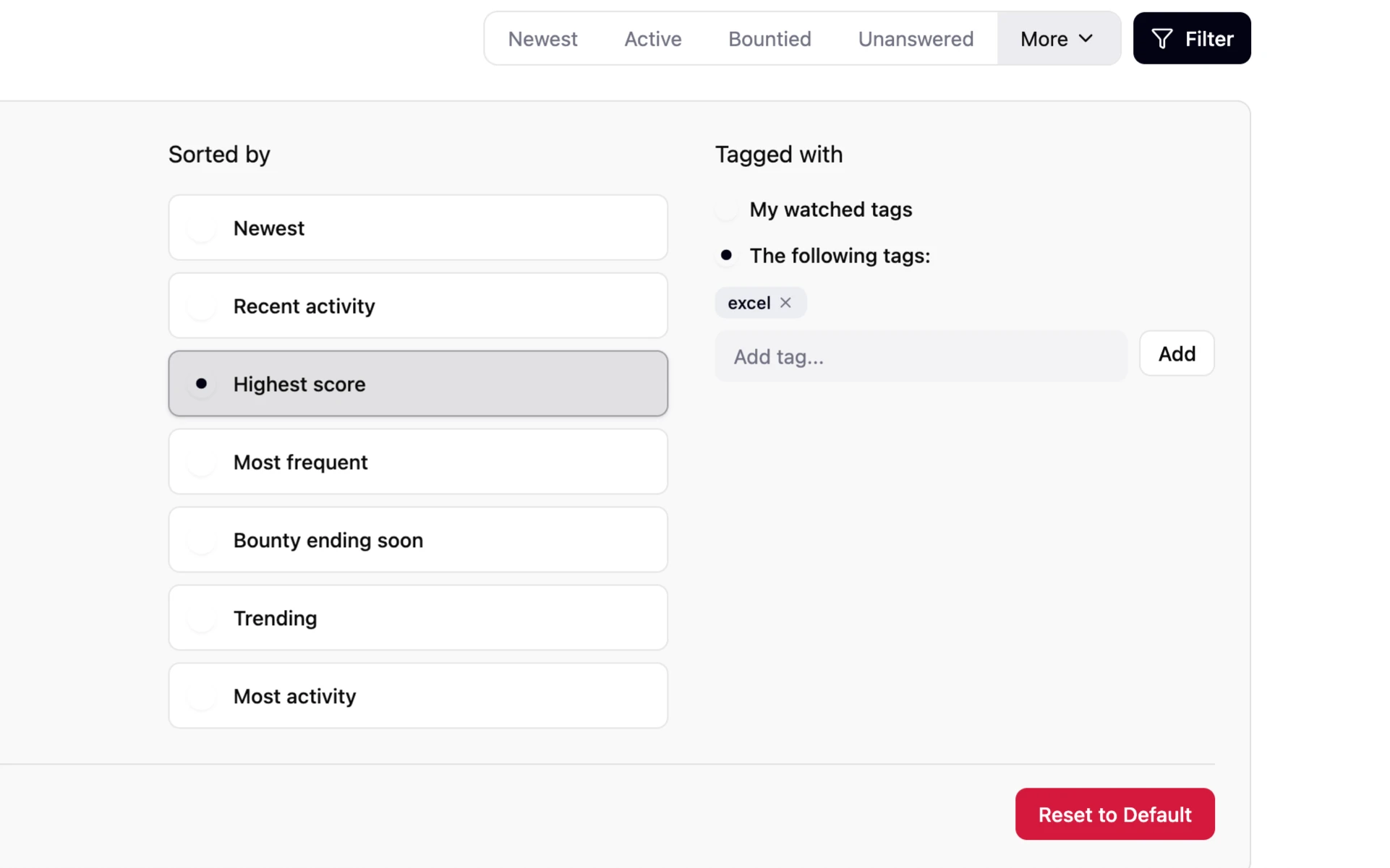
Stack Overflow: Smarter Tag Filtering for Power Users
A personal project to elevate Stack Overflow’s tag browsing by enhancing user control, visibility, and ease of navigation.
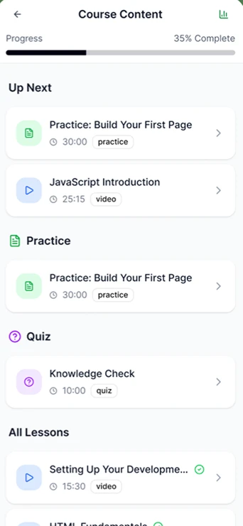
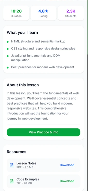
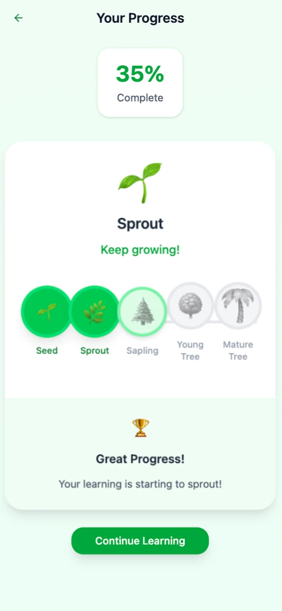
Navigating Learning: Designing Course Progression 🍃
Created a seamless experience for users to navigate multiple lessons within an educational platform, focusing on intuitive flows and clear progress tracking.
GET IN TOUCH!
tuckerzora@gmail.com
Resume


