Home
About
Resume
Navigating Learning: Designing Course Progression 🍃
Created a seamless experience for users to navigate multiple lessons within an educational platform, focusing on intuitive flows and clear progress tracking.

Overview
Looking to develop my skills, I designed the lesson interface for an online education platform, inspired by industry leaders like Skillshare and Udemy, based on the uxtools.co scenario. My primary focus was on crafting a user-friendly experience for learners to move through multiple lessons within a single course. I wanted to take a project from beginning to end, from research to interactive wireframes, which sharpened my wireframing and prototyping abilities. This project was an opportunity to address real user frustrations with complex course navigation, aiming to make learning both enjoyable and efficient. Tackling these challenges head-on helped me develop both my technical skills and empathy for users.
Goals
The main driver was to improve the lesson progression experience for online learners. Many users find it confusing or tedious to keep track of their course progress, which leads to decreased engagement and incomplete courses. My goal was to create a clear and motivating journey through lessons that encourages completion and boost satisfaction. Additionally, I wanted to use this project to advance my own wireframing and prototyping capabilities, creating interactive designs that could be easily tested and iterated upon. Ultimately, the aim was to deliver both a better user experience and more robust UX skills.
GOAL 1
Design a lesson navigation system that keeps learners oriented and motivated.
GOAL 2
Create wireframes for quick experimentation for placement
Wireframes
I began by sketching out the primary user flows for navigating between lessons, focusing on layout clarity and minimal cognitive load. These low-fidelity wireframes allowed for quick experimentation with different progress indicators, menu placements, and action buttons. Feedback from peers and potential users led to several iterations, including adding a persistent progress bar and simplifying the lesson list view. The wireframing process was essential for spotting usability issues early and validating design choices before moving to high-fidelity prototypes.

First Low-Fidelity Wireframe
Nurturing growth through meaningful tree imagery 🌳
I chose tree imagery not just as a visual motif, but as a symbol of growth and continuous learning. By weaving this element throughout the design, I aimed to encourage users to see their progress as part of a larger journey, inspiring them to keep moving forward and embrace new opportunities for personal development.

Learnings:
Iterative wireframing uncovers usability issues before high-fidelity work begins.
Clear progress indicators help users feel accomplished and reduce drop-off.
Prototyping can speed up feedback cycles.
Next Steps:
Test the interactive prototype with real learners to gather further insights.
Integrate accessibility features to support all users.
Develop a component library for consistent design in future modules.
Read more of my case studies
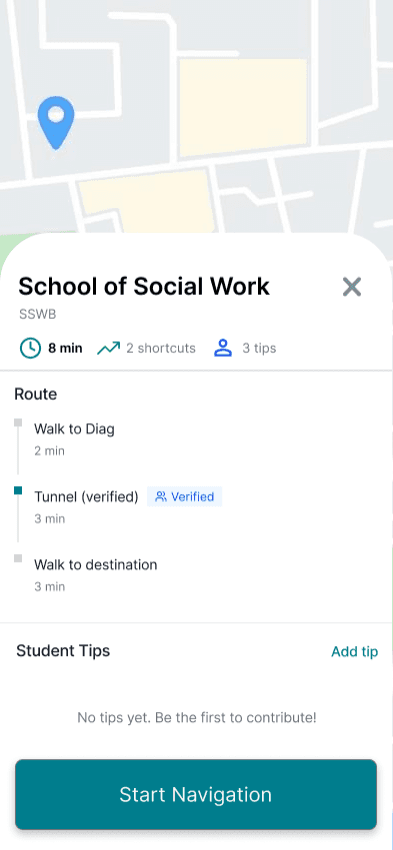
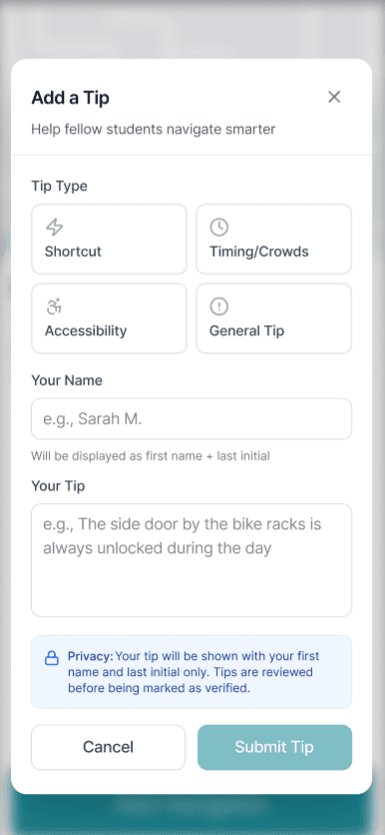
Campus Pathways, Finding the right door fast
Designed a mobile campus intelligence layer that guides students to the exact entrance and route, not just the building. Led UX research, product strategy, and UX design to reduce confusion and late arrivals.
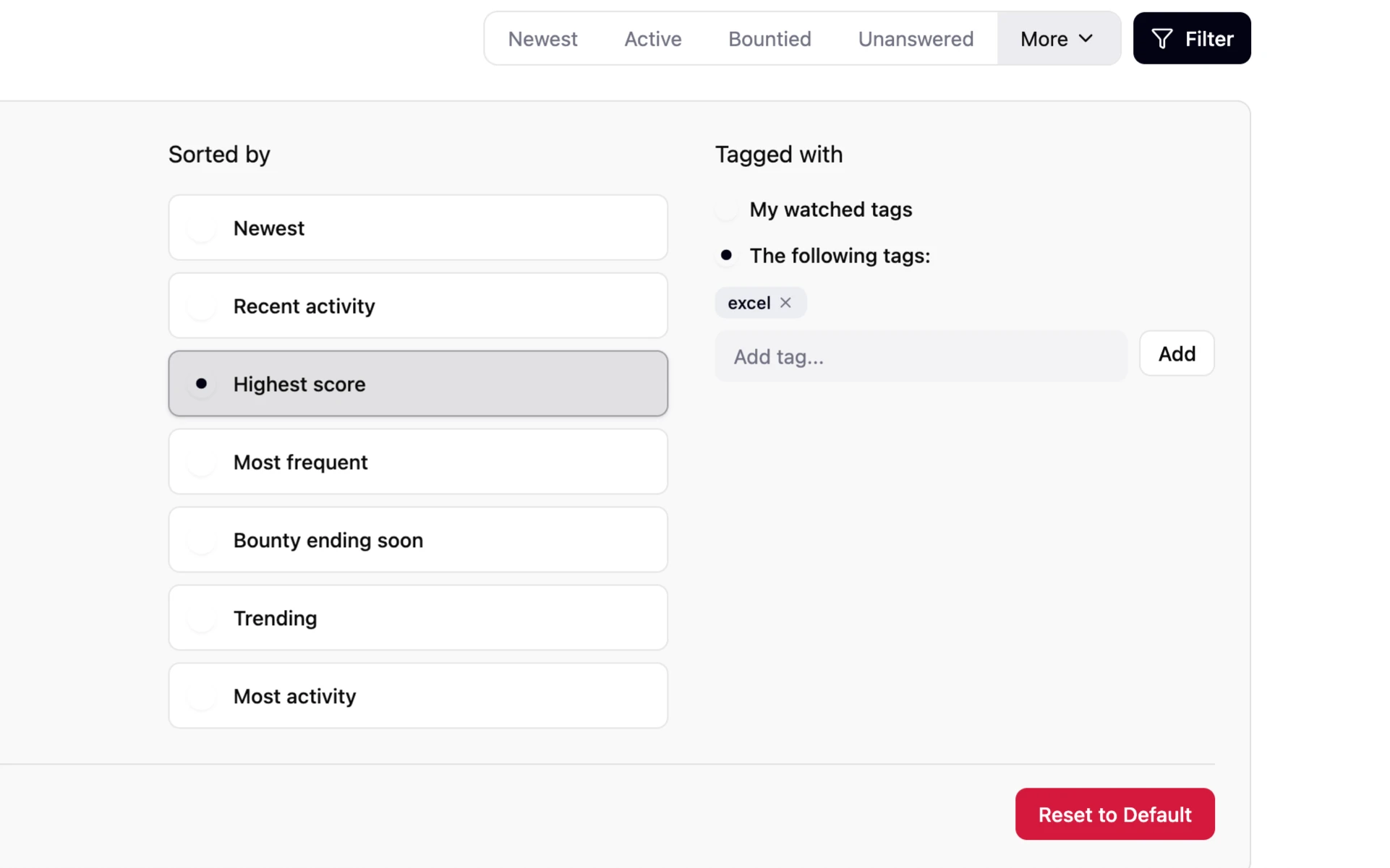
Stack Overflow: Smarter Tag Filtering for Power Users
A personal project to elevate Stack Overflow’s tag browsing by enhancing user control, visibility, and ease of navigation.
GET IN TOUCH!
tuckerzora@gmail.com
Home
About
Resume
Contact