Home
About
Resume
Stack Overflow: Smarter Tag Filtering for Power Users
A personal project to elevate Stack Overflow’s tag browsing by enhancing user control, visibility, and ease of navigation.
Overview
Stack Overflow’s vast knowledge base can be overwhelming, especially when users aim to locate the highest-scoring posts under specific tags. This was a personal project that started with a heuristic evaluation. I analyzed how effectively the existing platform supported this common workflow. My focus was on reducing cognitive load and making interactions more intuitive. Through a targeted redesign, I empowered users to filter, reset, and understand their current browsing state with ease, ultimately improving both efficiency and satisfaction.
Goals
The project was driven by the need to help users quickly find the most relevant content without cognitive strain. Stack Overflow’s original interface required too much memory recall for sorting and filtering, resulting in wasted time and frustration. I wanted to shift the experience to one of recognition, giving users clear context about their current filters and an easy way to start fresh. The redesign set out to increase user efficiency, reduce confusion, and make advanced filtering feel effortless.
GOAL 1
Enable users to easily identify and control active filters and sorting.
GOAL 2
Reduce reliance on memory recall by providing clear, contextual cues.
GOAL 3
Allow users to quickly reset filters and return to the default view.

Problem
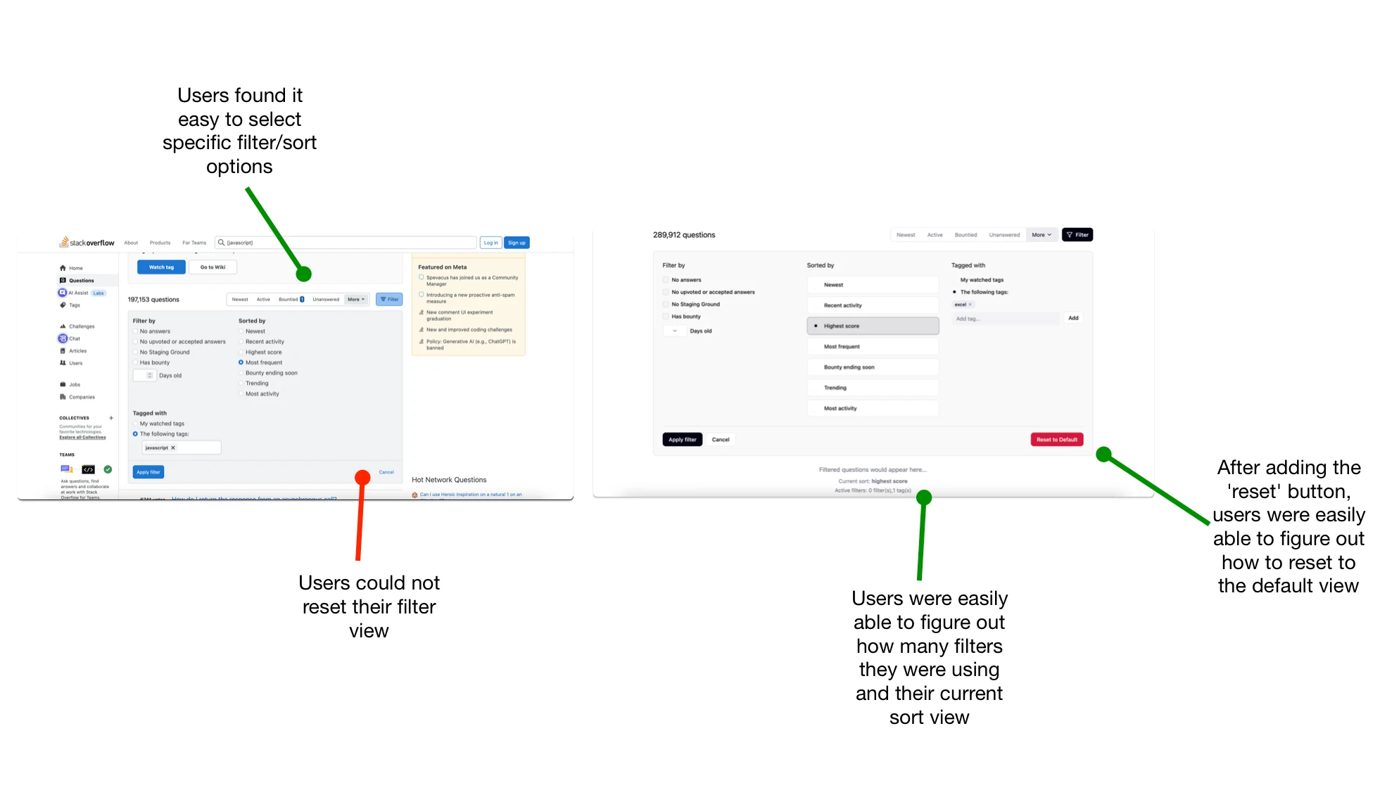
Several users struggled to understand which filters were active and how to revert back to the default view.
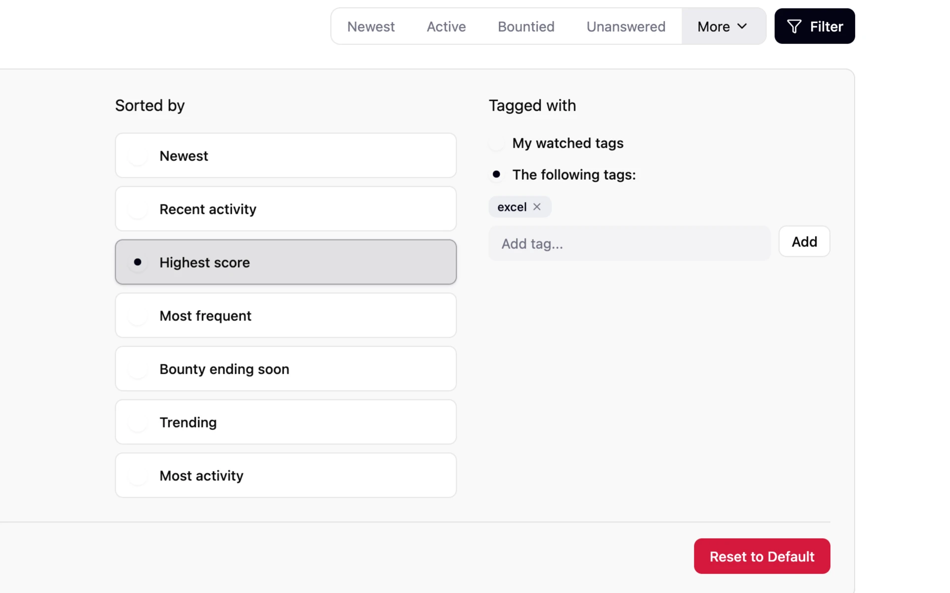
Solution
I introduced a clear 'reset filters' button and a visible summary of current filters and sort selection, which provided instant recognition and easy control.
Key Usability Testing Evaluations
What I Learned:
Small interface changes can deliver big improvements in usability and user confidence.
Users strongly prefer visual cues and status messages over hidden states or recall-based actions.
Direct reset controls reduce friction and encourage exploration of more advanced filters
As a beginning project, gaining users' feedback allowed me to see that what I thought was the most useful wasn't always useful to most users
Read more of my case studies
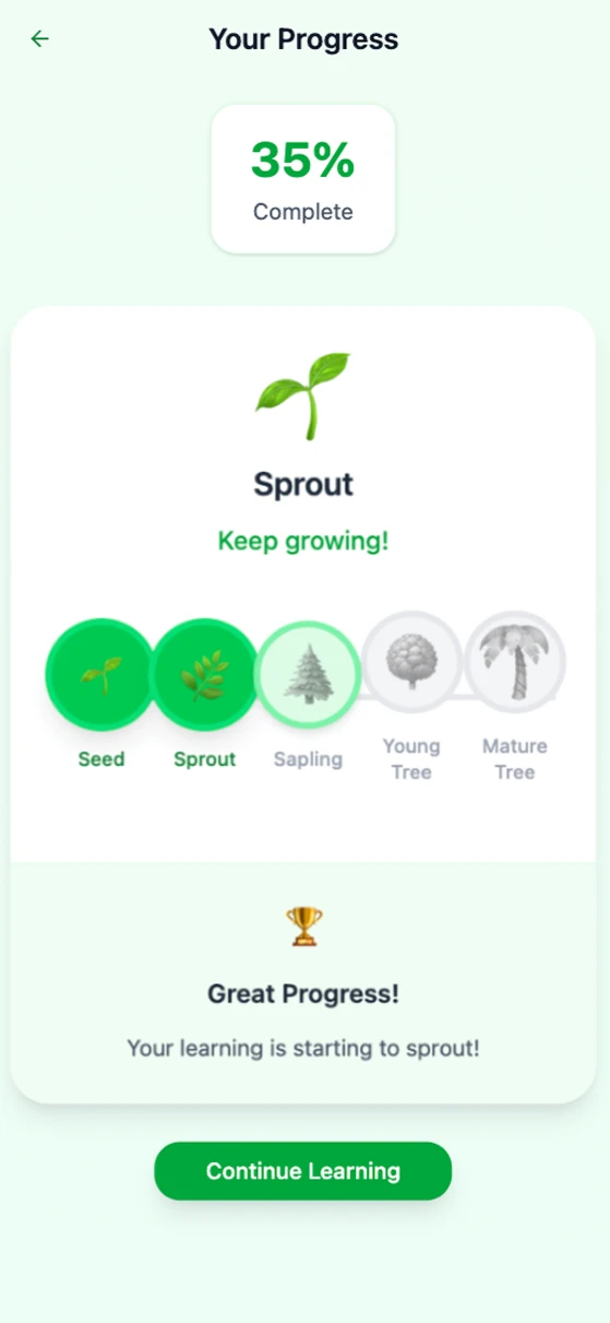
Navigating Learning: Designing Course Progression 🍃
Created a seamless experience for users to navigate multiple lessons within an educational platform, focusing on intuitive flows and clear progress tracking.
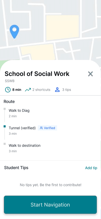
Campus Pathways, Finding the right door fast
Designed a mobile campus intelligence layer that guides students to the exact entrance and route, not just the building. Led UX research, product strategy, and UX design to reduce confusion and late arrivals.
GET IN TOUCH!
tuckerzora@gmail.com
Resume